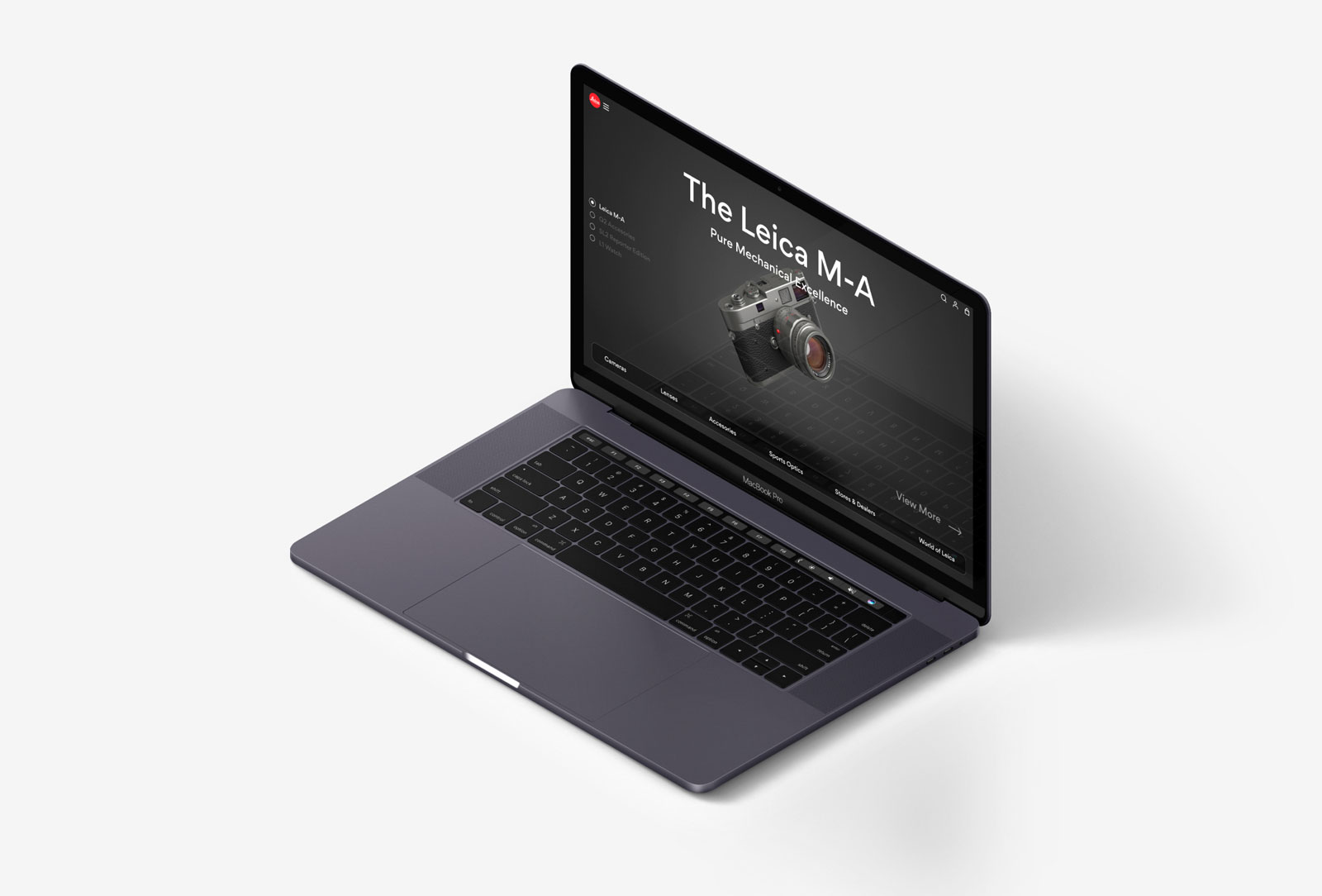
During the second half of the year I worked at Leica, I was put on the web design team as a UX designer to support in creating a new website. As such I created a concept to outline a design direction that the company could take in the future. I coded a mockup website using my knowledge of HTML, CSS & Javascript so that the team could fully experience my design intent.

In contrast with the existing Leica website, my design intent was to use a reductive approach to draw focus and emphasise on the products. This was one of the major design considerations. I tried to achieve this in a number of ways. First, I reduced the amount of text but drew emphasise on the text that I did keep, making the titles larger and increasing their visual hierarchy. Secondly, I reduced the colour contrast, opting for a monochromatic colour scheme to accentuate the red of the Leica Logo and the material colours of the Leica products. Finally, I used larger product images and integrated the images with the text, removing the borders between product images and the main website experience.

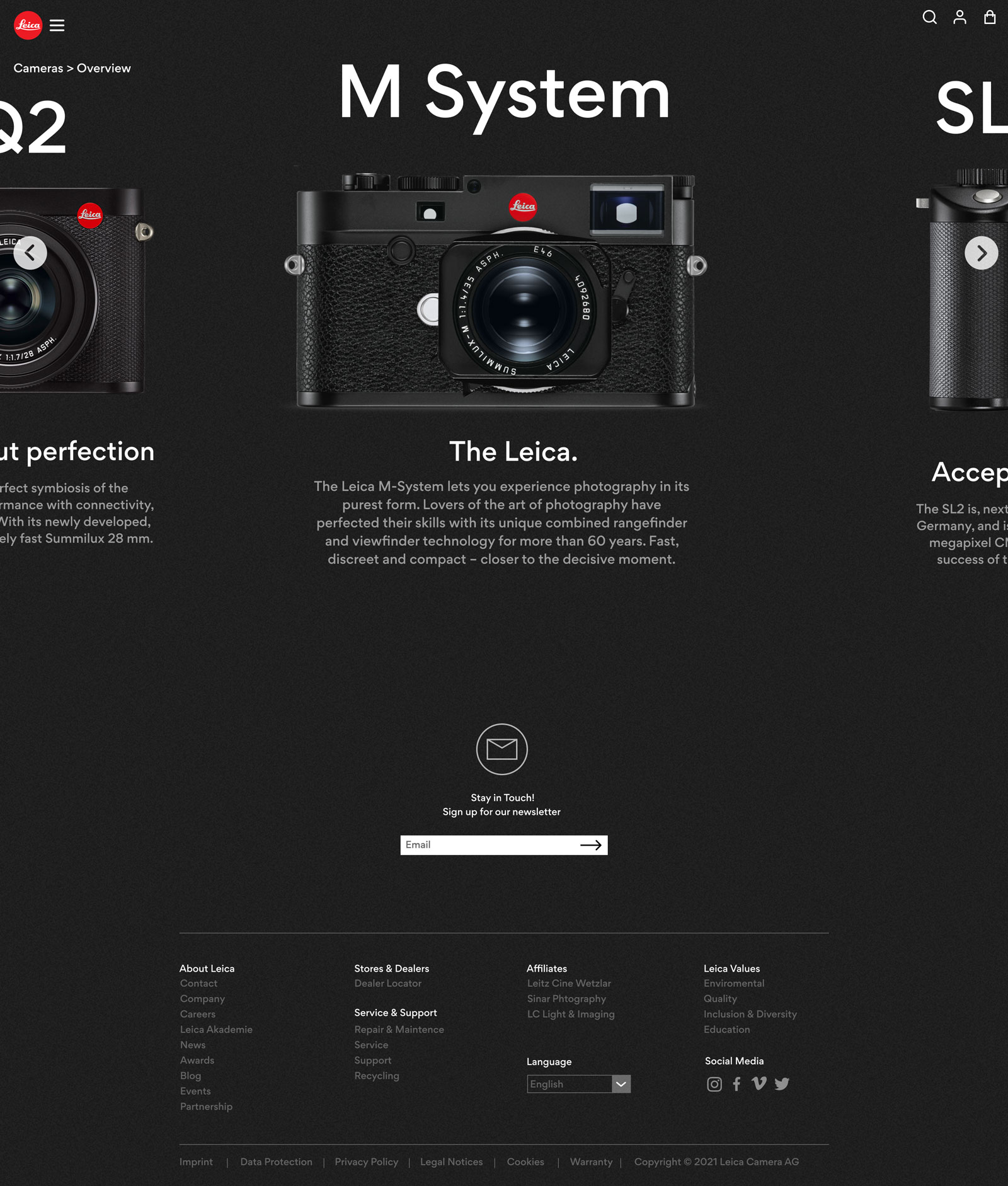
I wanted to reflect the physical experience of using a Leica but in digital format. I made efforts to inject elements of traditional film photography and the Leica design aesthetic into the pages. For example, if you look closely, the background of the pages has a subtle grainy effect. This is a playful reference to the old days of film photography when Leica first made a name for themselves.

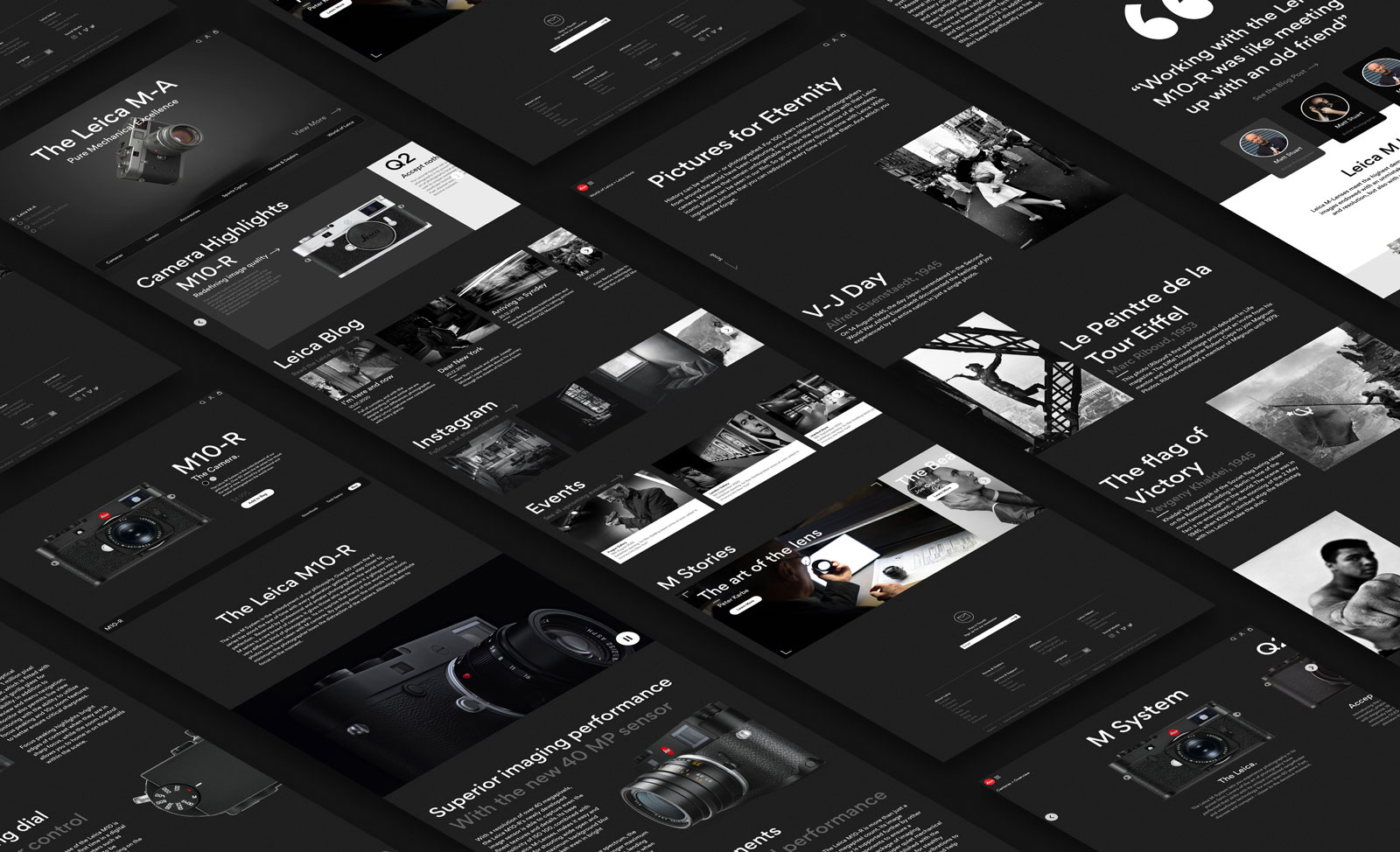
This is the index page for the website, the aim of the index page was to offer users insight into Leica updates and provide quick links to the various parts of the website. The top section contains a carousel to show newly released products and upcoming events, next there are camera and product highlights, which allow users to quickly navigate to the most visited product pages and help users unfamiliar with Leica's product line up to get an overview of the product range.


This is an example product page. With the existing Leica website, the product explanation page and the shop page were separate, in this concept, I aimed to merge these two pages into one combined page. The top of the page deals with the shop aspects while the lower half of the page is dedicated to explaining the product features and getting the user invested and inspired by what the camera has to offer. I tried to showcase the features of the product in a more natural and organic way, taking a more experience and visual-based approach rather than relying on stats.

Leica has an extraordinary history and my aim with this page was to show the stories behind some of the world's most iconic images taken with Leica cameras in order to get the user more invested in the brand.